
Lorenzo Koning
Read all my blogsWhen setting up a webshop, an important thing to have in mind is to make the site fun and interesting to browse. The last thing you would want is for potential customers to get frustrated by how unpleasant a page is to browse and navigate. That is why user interaction and user interfacing are two very important subjects that are sometimes oddly seen as an afterthought.
Know your audience:
Before you can start working on the user interface or interaction, it is very important that you have a clear picture on who your users are. What are their goals, what are they looking for, what are their preferences. Once you understand who you are building the webpage for, you can start to think about how you can best incorporate their needs and expectations in your designs.
Simplicity is key:
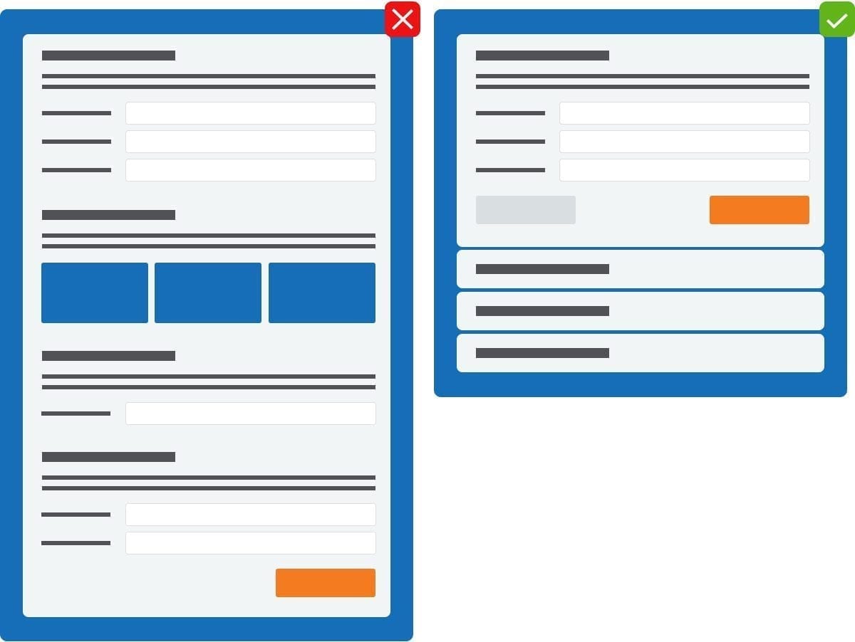
Whoever your target audience is, one of the most important things is to keep it simple. All those fancy animations, pop up offers and bells and whistles won’t do you any good if your potential customer leaves your page to shop at a competitor where they can at least do what they came to the shop to do. Always ask yourself the question: am I implementing this because I want it or because my users need it? Another thing to keep in mind is to create the shortest path possible for your users. does the customer really have to see a pop up whenever they want to delete/remove something? or should this be reserved for the most critical data.
If you can implement a feature in two pages, why use five?
Simplicity also applies to any labeling or messages you implement. keep it short, sweet and to the point. tell your users what they need to know and make sure they can understand what you want them to understand. If for example a user is creating an account but their passwords don’t match, all you need to do is tell them that their passwords don’t match. The user is not interested in the fact that within the accountCreationController the validatePasswords function was not able to return true.
Feedback, feedback, feedback:
It’s not only paramount to make these messages simple and easily digestible, but also to give these messages often. this does not always have to be with text, but visual cues or audio cues can work as well, As long as you make sure that these cues are interpreted the way you want them to be interpreted. using a buzzer sound to indicate that data was successfully saved might not be the right choice.
Mistakes will be made:
No matter how simple, clear and to the point your user interface is, there will still be mistakes here and there. This doesn’t have to be because a user doesn’t understand the task at hand mind you. It could be something as simple as a miss-click. It is important to tackle the mistake and not start with a clean slate. No one likes to have to fill out an entire form all over again after a typo in one of the input fields.
Consistency: bringing order to anarchy:
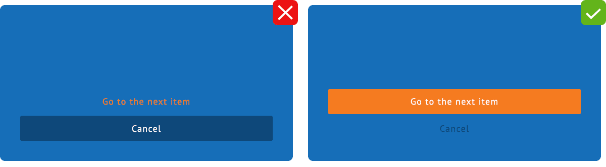
All of these points are all well and good but if you can’t tie everything together visually your users will most likely leave your webpage with a raging headache. First thing is to be consistent. Make sure that similar interface elements work as expected so that once the user learns how something works, they won’t have to relearn it on the very next page. This will allow users to get where they want faster and to make consecutive visits to your webshop more time efficient for them.
Another important thing to learn is how to guide the eyes of your potential customer. building a visual hierarchy allows you to guide your users to the most important parts of your webpage. This can be achieved by thinking about color, size and placement.
A big orange button in the center of the screen of a largely blue webpage will be seen much faster than a small blue button in the corner of the same page.

Receive our weekly blog by email?
Subscribe here:
